AROUND THE CLOCK
Packaging Design | Brand Identity
Around the Clock is not just a beverage company; it’s a lifestyle brand that embraces the vibrant energy of both late nights and early mornings.
-
Our unique concept combines the convenience of canned coffee with the sophistication of craft beer, catering to those who appreciate quality drinks no matter what time of day.
-
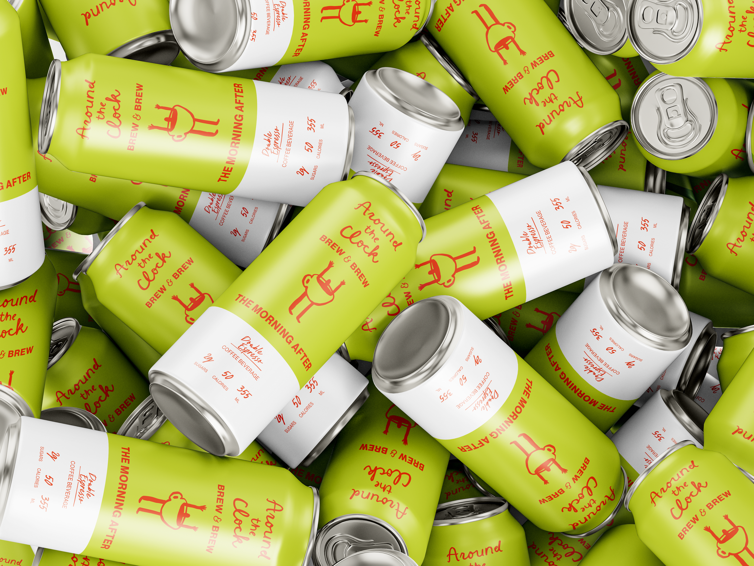
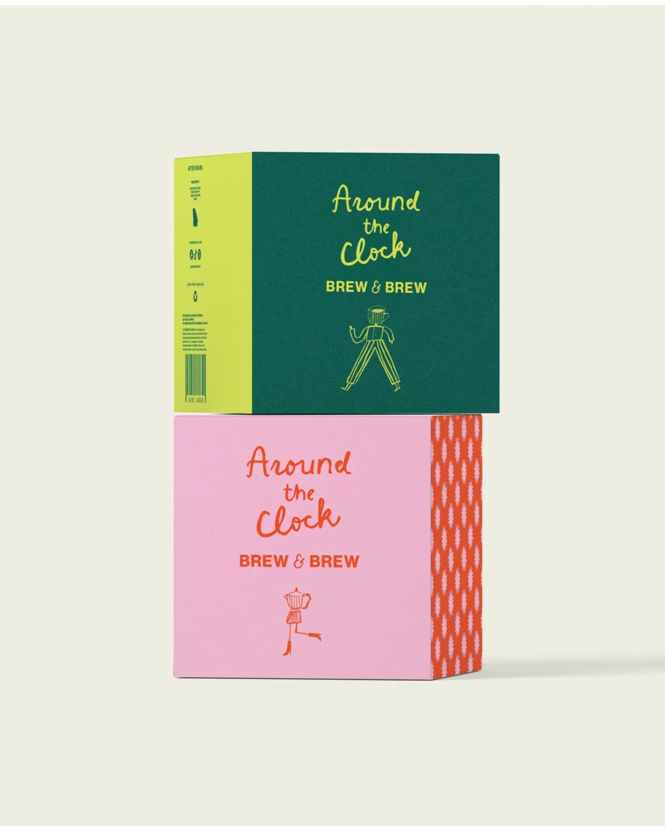
The design approach was intended to reflect the dynamic contrast between night and day. The color palette incorporates two warm and two cool colors. The warm hues symbolize the invigorating energy of the day, while the cool tones represent the calming serenity of the night.
-
The brand’s visual identity intertwines elements drawn from the essence of both coffee and beer. Four distinct icons were crafted to uniquely embody each beverage, while the patterns adorning the beverage cans reflect the liveliness and cheerful spirit of the company.

