EXPERIMENTAL TYPE
Typography \ Layout Design
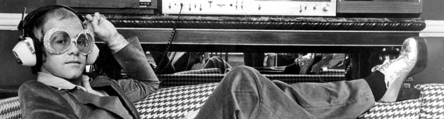
I was asked to create unconventional newspaper spreads centered around hand-made experimental typography, all inspired by a persona of my choosing, Elton John.
-
Since the start of his career, Elton John has been an advocate for social change and authenticity, both of which I really admire. He is a constant source of creative inspiration, and one of my favorite musicians.
-
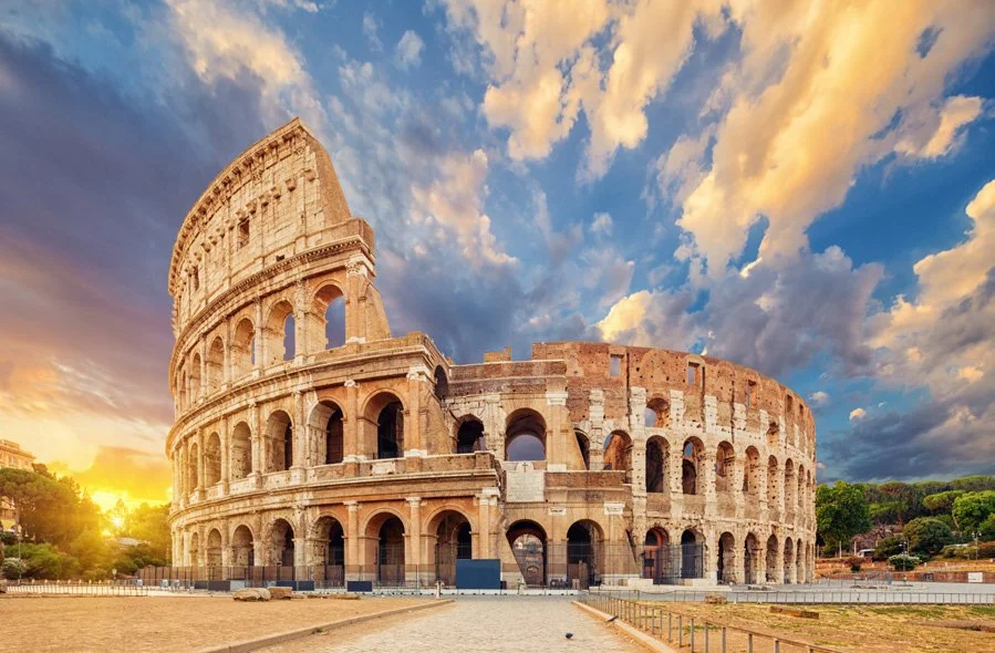
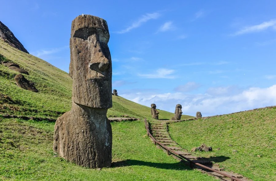
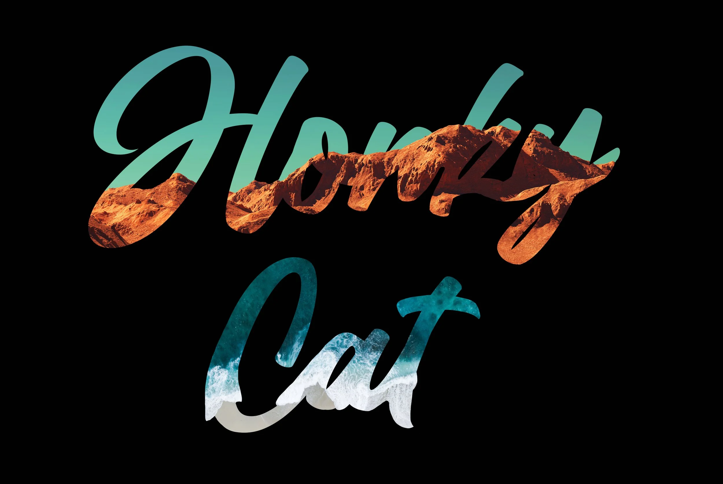
Phrase: Honky Cat
Place: The Open Road
Meaning: Being a musician, Elton John has spent much of his life traveling around the world sharing his music. "The open road" has become a second home to the singer.
-
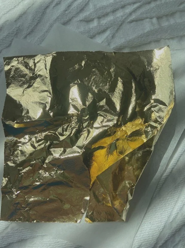
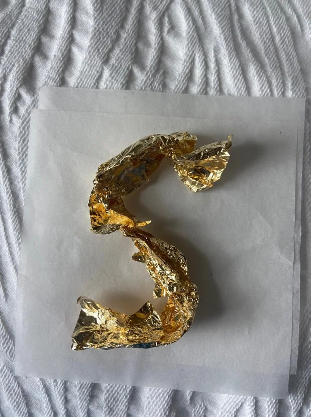
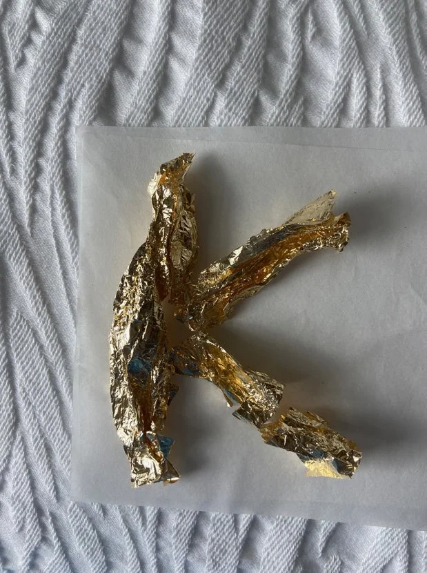
Phrase: Empty Sky
Texture: Gold Foil
Meaning: Empty Sky is Elton John's debut studio album, and the gold foil is representative of the stardom that he quickly acquired.
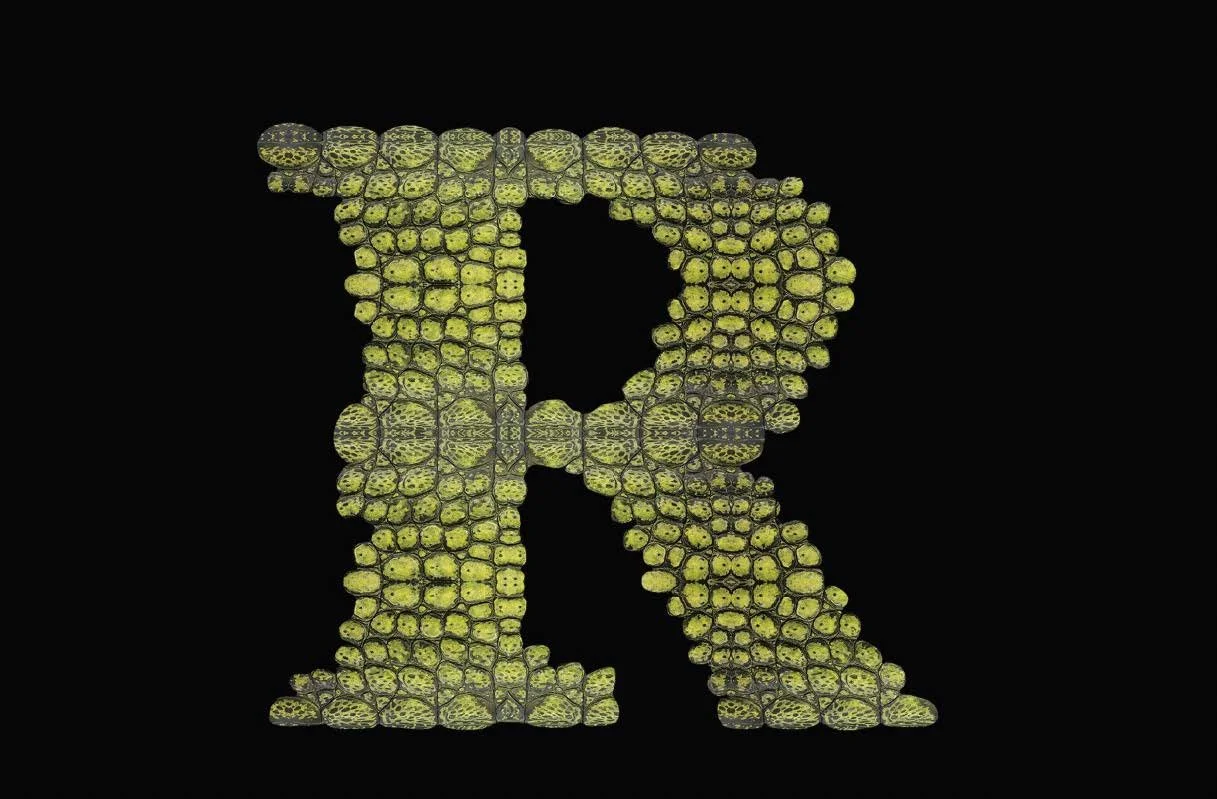
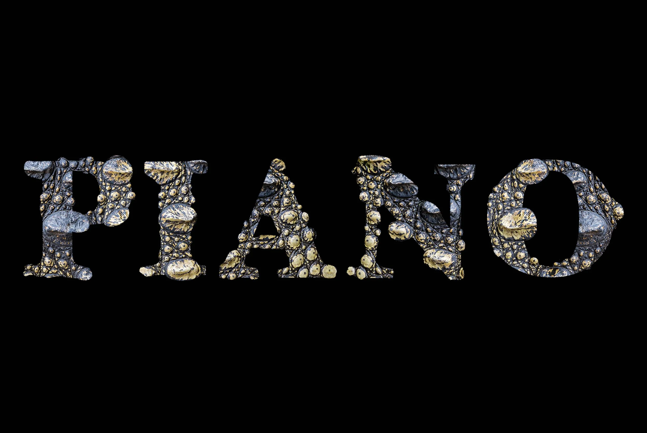
Phrase: The Piano Player
Texture: Crocodile Skin
Meaning: Known for his piano skills, Elton John is often called "the Piano player" and it is paired with one of his most famous songs, Crocodile Rock.
-
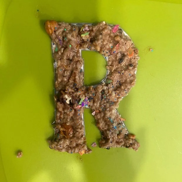
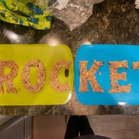
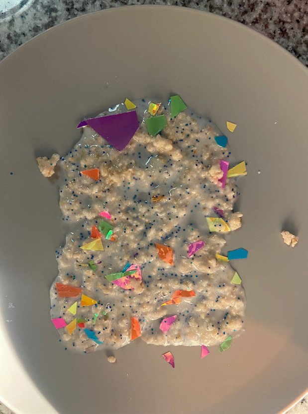
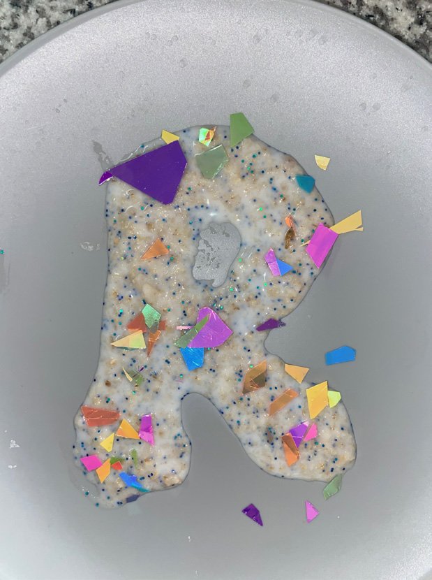
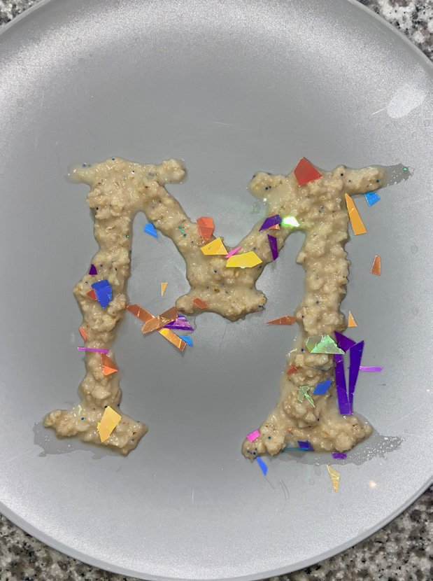
1. Phrase: Rocket Man
Materials: "Vomit" and Glitter
Meaning: Elton John's struggle with addiction — specifically the eating disorder bulimia.
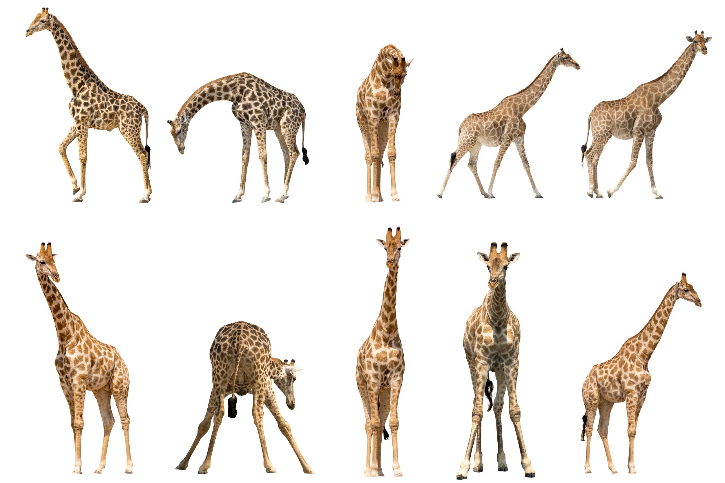
2. Phrase: Gay Jesus
Materials: Giraffes
Meaning: Elton John is an LGBTQ+ advocate and icon
PROCESS
By mixing together oatmeal, soy sauce, glue, and glitter, I was able to create a mixture that looked (and unfortunately smelled) like vomit. Then I shaped the mixture into different letters and photographed them. I wanted to simulate the internal struggle that Elton John faced while maintaining a professional image to the world.


PROCESS
I used pieces of gold foil to shape the letters. By ripping and manipulating the foil I was able to put pieces of gold together while still keeping small spaces of blank space. This was done intentionally to show the cracks and imperfections that accompanied Elton John’s start and success in the music industry.


PROCESS
I played around with different crocodile skin images, using the bumps and grooves to shape the letters. After finding an image that worked well, I used it to create the entire phrase. By choosing one of Elton John’s nicknames and combining it with the texture behind a popular song of his, it shows the connection of his music.


PROCESS
I took various images of giraffes and manipulated the animal to shape the letters. I chose giraffes because in popular culture they are often called “especially gay” for engaging in male-male sexual behavior more often than male-female sex. This is representative of Elton John’s sexuality, and how it has influenced not only his musical career, but entire life.


PROCESS
By using images of famous landmarks from around the world, I pieced together the phrase. The images are representative of Elton John’s worldwide success.